You’ll receive a Steam key for Rail Route directly from the developers of the game.
❤️ Thanks for your great support!
RailLog #8: Sprites
Check out the next portion of news from the Rail Route development team.
Hello Dispatchers!
Let me share what we’ve achieved this week while preparing the next update of Rail Route, our train dispatcher simulator game.
Sprites Revision
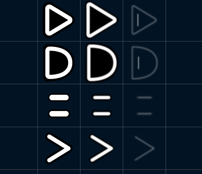
We have multiple sprites for every element on the board. The first column is for a zoomed-out camera to show a simplified version. To achieve a nice neon feel, we compose the sprites from two layers in the standard view. A solid layer and an emission layer (on which we can control the intensity of the glow in our shaders) above give the glowing feel.
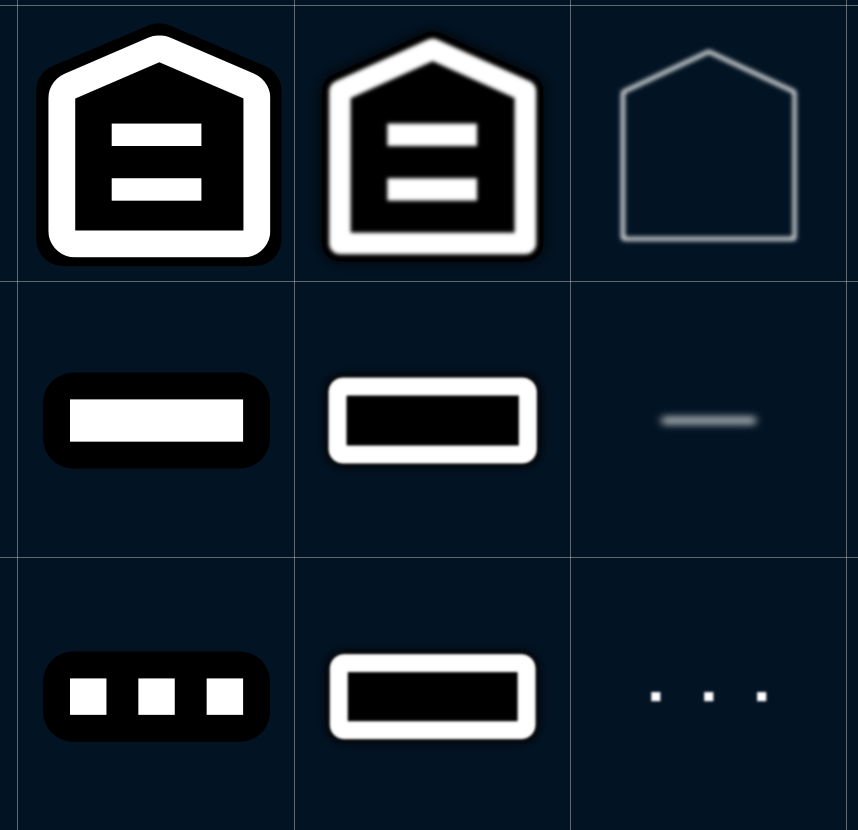
So we revisited all sprites; some were missing this emission layer (tunnels, coach yard, sensors), and some were missing the zoomed-out variant. They are all clean and beautiful now. We could also call them high-res now, as the resolution has been increased twice. And while we aligned them correctly to a power of two sizes, they can now be compressed, so the size remains the same. That’s a double win.
Building Sprites
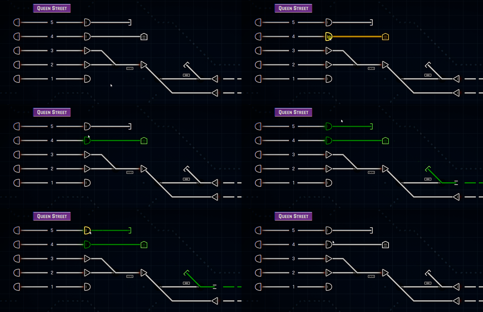
Construction UX refactoring is still outgoing (a big task!), and we revisited the sprites we’ll be using in a construction.
![]()
There’s a new indicator for a cursor where you will build a track and which track will be modified. That also applies to any point, like signals or sensors.
![]()
New Borders
Maybe you see a different sprite for “borders” than what you are used to. We made them stand out in building mode to help new players understand their purpose. It needed to be clarified, and we also received some feedback to make them more visible, as the contrast could have been better. While they are unimportant during “operational” gameplay, you must see them clearly while construction progresses.
![]()
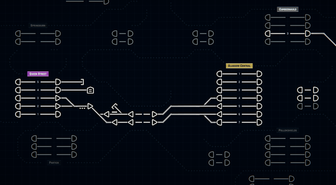
Zoomed-out Map
All sprites also received their zoomed-out variant, while others have been polished. Mainly the sensors were missing, but tunnels and coach yards should now be clearly visible.

Sorry, the fluent gif had over 50MB, and there’s no possibility to use a format other than gifs.
While all the sprites are now in place, this zoom level still would need more love and adjustments. But this change should already be a significant improvement. Next thing to go on this topic would be better train labels and alerts, scaling with the zoom level. This is how the zoomed-out level looks now.
Construction UX
Nothing significant (to be visually shared) happened last week, but the work continues intensively, providing a solid foundation for future content in new buildings and sensors. We need the flow to be robust, simple, and easily understandable by newcomers.
We want to release these significant changes in construction somewhere at the end of April, including new possibilities for platforms, autoblocks, and stuff I mentioned last week.
UI
A new graphic has joined our team to fully work on the new fluent UI experience we are preparing. It’s a relatively long-term task, and while some groundwork has already been done, there’s nothing unique or visually attractive (in a polished state) I could share with you. I hope there will be more next week while we progress forward. These changes are planned after the Construction UX update, as they’re even more enormous.
Midweek Update
Our Chinese community will have a minor update this week, which brings them localized stations in stock maps, so stay tuned.
Until then, happy dispatching!
You’ll receive a Steam key for Rail Route directly from the developers of the game.
❤️ Thanks for your great support!

