You’ll receive a Steam key for Rail Route directly from the developers of the game.
❤️ Thanks for your great support!
RailLog #5 – New UI
Hello Dispatchers,
Welcome to another developer blog series, RailLog! Hopefully, you’ve enjoyed our small Valentines Update and we are back focusing on the bigger tasks in front of us in our path to 1.0.
This time, I will be focusing on the upcoming changes to the game’s user interface. As many of you know, the user interface is a crucial aspect of any game, and we have received a lot of feedback from our players on how we can improve it. Our team has taken this feedback into consideration and has been working on implementing changes that we believe will make the game more intuitive, user-friendly, and aesthetically pleasing.
I’d also gather more feedback, so please, put your comment under the post if you have any concerns or ideas! Better now than later.
UI panels composition
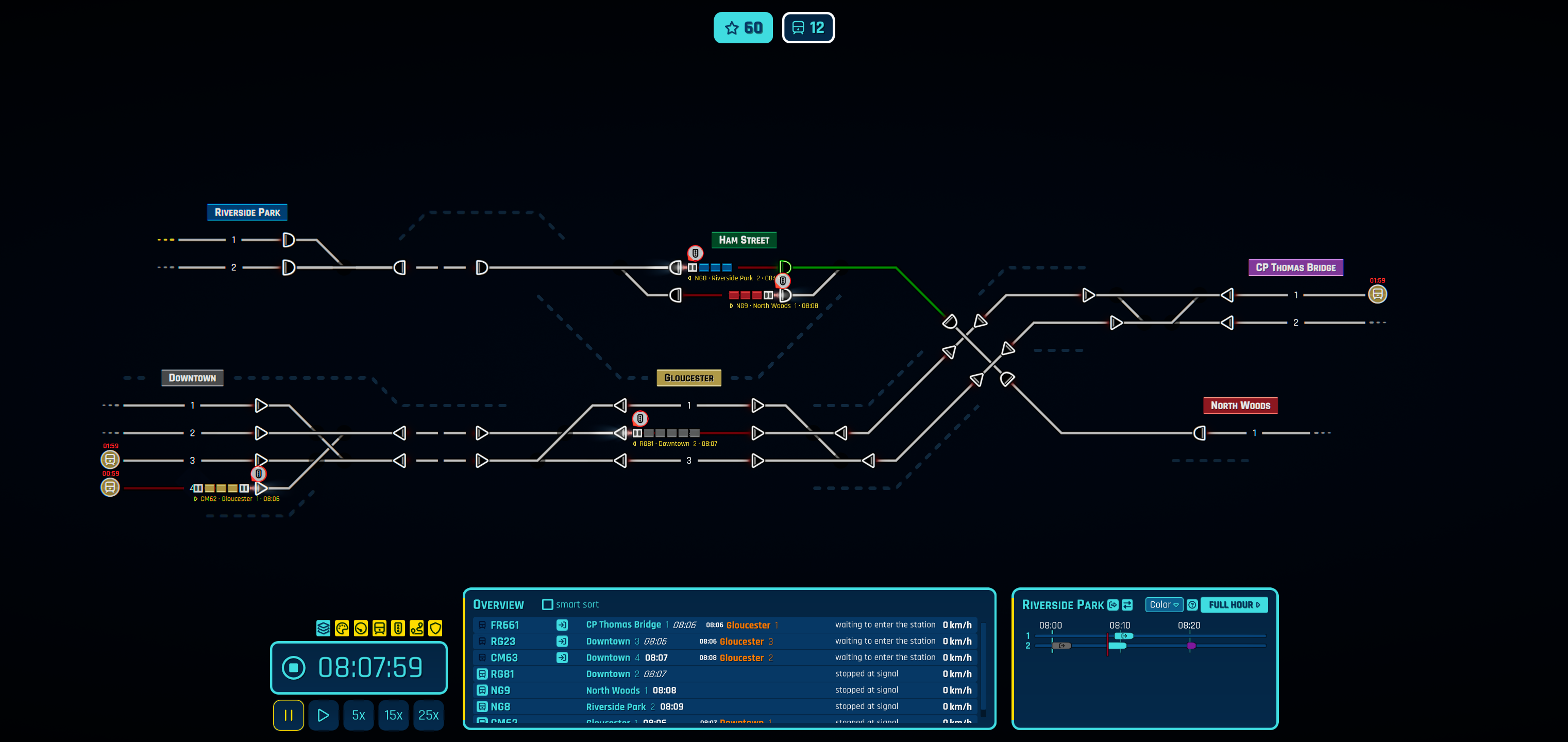
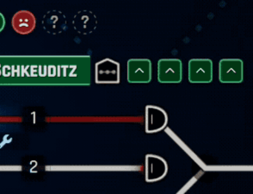
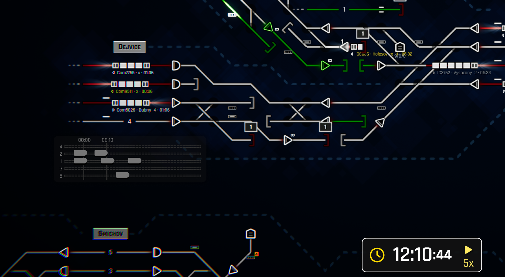
Let’s have a look at the current state. There are two big “bottom” panels. While the left one shows either list of trains (overview panel) or the train detail, the right one is either the station timeline or the node detail (for example, the sensor configuration). What’s wrong? Both are doing a different kind of business while taking so much space but also providing little space. It feels like an oxymoron, but let me explain that. Let’s have a look at our mockup of a new interface first.
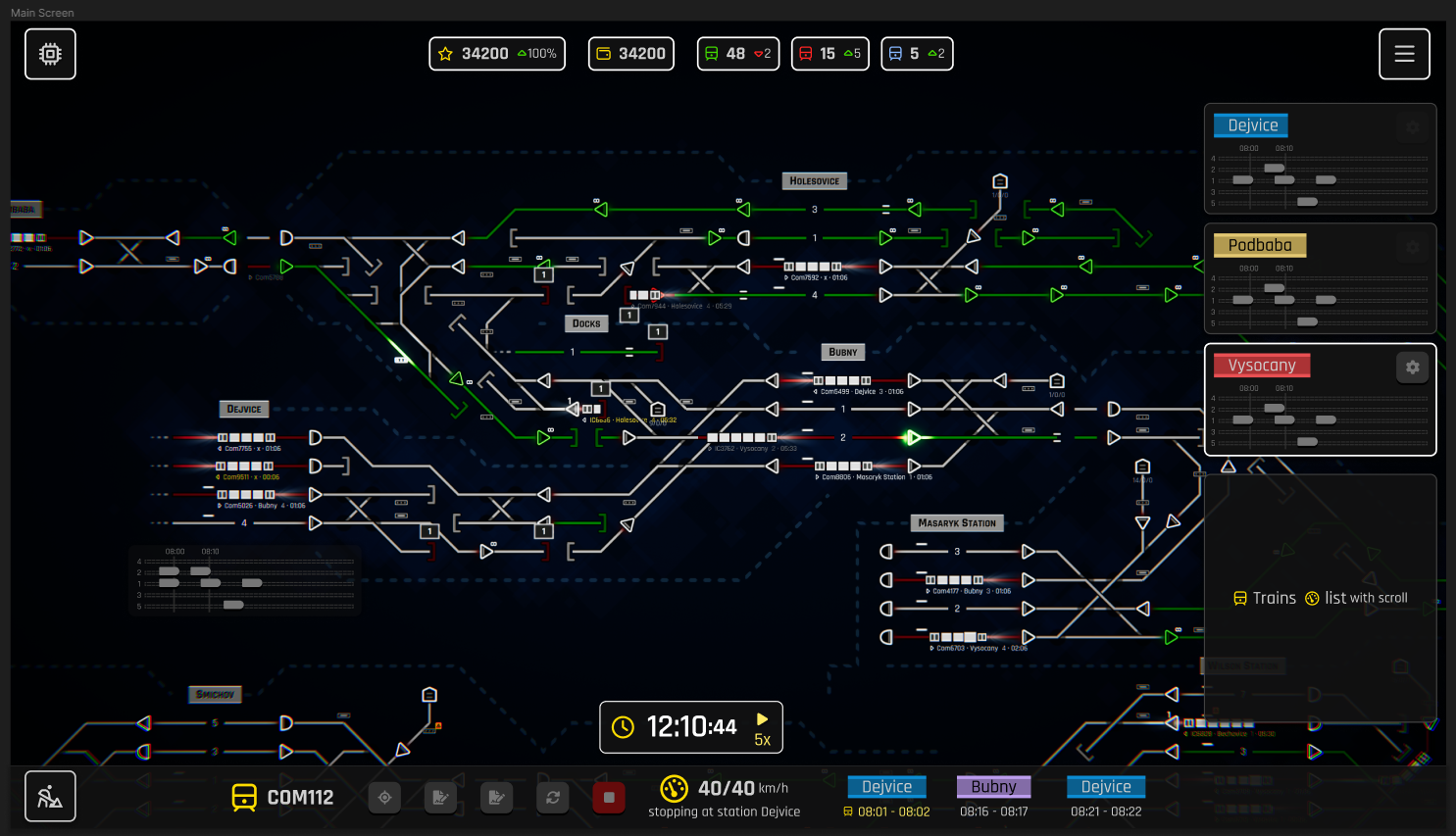
The most significant notable change (next to the different color pallette) is getting rid of these bottom panels. We’ve realized we can’t share a space for the station timelines with node details (bottom right panel). When you need a node (signal, sensor, etc.) detail, you want to configure it – for example, the sensor configuration. But you don’t need that panel to be visible while you are actually “playing” the game. On the other hand, the station timeline is something crucial to be visible all the time. And not just once, right? Clearly, it’s the most wanted feature as of now.
Info Panels
That’s why we want to introduce Info Panels in our upcoming UI. These panels are stacked at the edges of your UI. You can move or order them at your wish, but they show you crucial information about your gameplay.
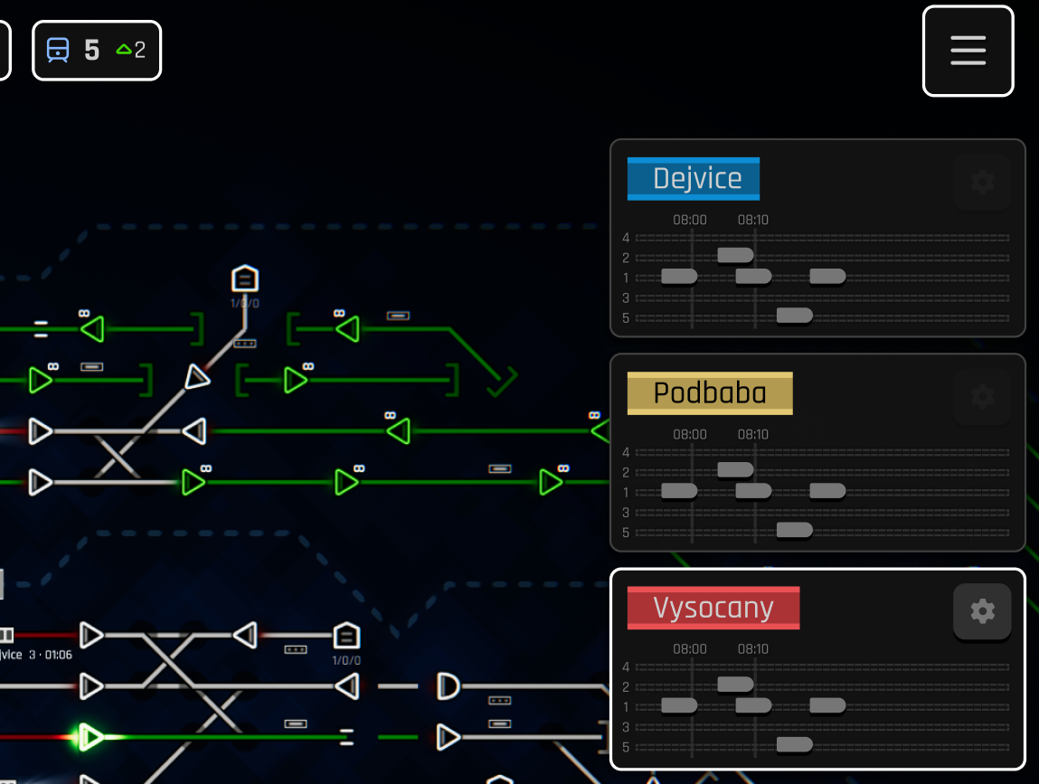
Do you want to see a timeline for multiple stations? Not a problem at all; add the corresponding station timeline panel. Visible all the time at your disposal. Left or right edge of the screen.
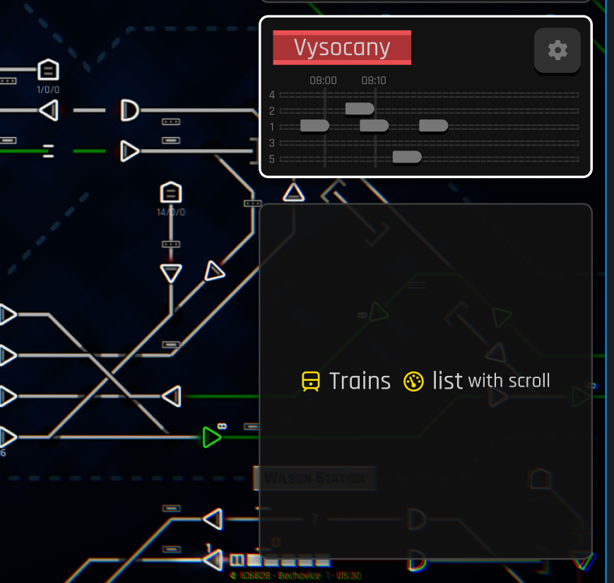
This is also where the updated overview panel (more of a train list panel) will go. We could redo it a bit to be like an alert list window, but we are not yet done with its design. And we are kind of unsure, what functionality you would like to see in it. The current overview panel is too big with too much of a text (so small on Steam Deck for example) so it requires some updates. Share with me how you using it and what information is crucial for you, please.
The other important feature of these info panels is that you can also put them on the board, as you can see in this example. Important info belongs where needed, so we’ll allow you to “glue” the panels directly to your Dispatcher Board. The good thing is that the map author can do that and save that configuration of these glued panels with the map.
We maybe introduce more of these panels after 1.0, but for now, we plan just the station timeline and the train list to replace the current UI functionality.
Detail Panels
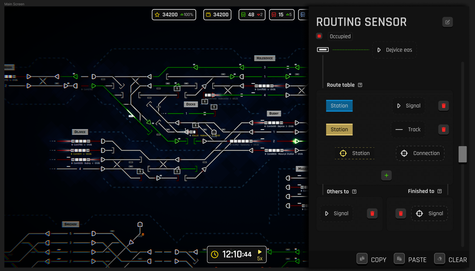
As mentioned, the bottom right panel must be bigger for our big game. We’ll introduce the Detail Panel, taking 1/3 of the screen. The purpose of this panel is to do business there and then be closed — no need to have it open during your usual gameplay. Provided with this vast space, we will have more freedom to design these details panels or others in that spot (map configuration in the editor and others). We are also considering using this panel for any schedule modification, including per station or train. Hopefully, I’ll have more designs to share soon because it seems that’s also very important aspect of the game where the UX needs to be improved.
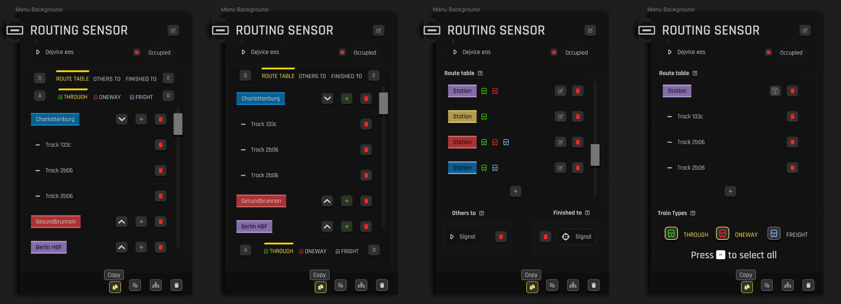
At this point, we still need to come up with a reasonable composition for our most advanced configuration of routing sensors. That’s the most complex detail panel so far, and we also want to introduce even more functionality (for example, one station to multiple connections routing); it’s getting even more complicated.
Maybe a different approach to that bloody complex sensor needs to be done. One way would be to decompose it into multiple buildable, interconnected elements but that seems like a lot of work we probably can’t manage to do in a reasonable time frame, but who knows? Let me know if you have any great ideas :).
Other than that, see you next week.
Happy Dispatching!
-Angel
Follow us:
You’ll receive a Steam key for Rail Route directly from the developers of the game.
❤️ Thanks for your great support!
Share This Story, Choose Your Platform!
Related Posts